Glossary
Graphs
Several different graph types are available in the Analytics Suite:
- Pie charts show how the main elements are broken down for the period being analysed ;
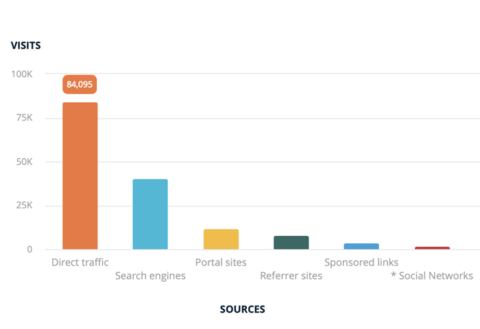
- Bar charts also show the breakdown of the main elements, along with values from corresponding comparison periods ;
- Line graphs show how the main elements are evolving over time ;
- Multiple Y-axes graphs let you analyse an element according to several metrics which do not necessarily have the same order of magnitude ;
- Radar charts let you represent 5 interest criteria on the same graph. The area contained inside this radar graph is proportional to user interest for browsing on your website ;
- Other types of graphs adapted to certain types of analyses also exist, such as “pyramids”, navigational diagrams, etc.
AT Internet’s added value
How we’re changing the analytics game
Find out how AT Internet will empower you to skyrocket your acquisition, conversion and retention rates. Our advanced and powerful solution is trusted by 1000s of our customers, including, the BBC, Le Monde and Total. Drive your web analytics into the fast lane!

ANALYTICS SUITE
Analyse, understand, decide
Analyse your web & mobile traffic. Understand user behavior. Boost your business by making quick and effective decisions.
Discover AT Internet
Who are we?
We’re proud to be recognised as a Top Rated tool by TrustRadius once again!
Discover why thousands of customers, including some of the world’s biggest brands, trust us.
Discover 20 best practices essential to any analytics strategy and data-driven decision-making.
GET IN TOUCH
CONTACT US
Interested in a demo of our solution? Want more info about our company (partnerships, press enquiries or other)? Our teams are available. Just leave us a few details in this form, and we’ll get back to you shortly.